Tactile Cashless payment system for events
Three iterations of the visual identity of Tactile, from their name and logo in 2017 to a detailed visual identity in 2023.
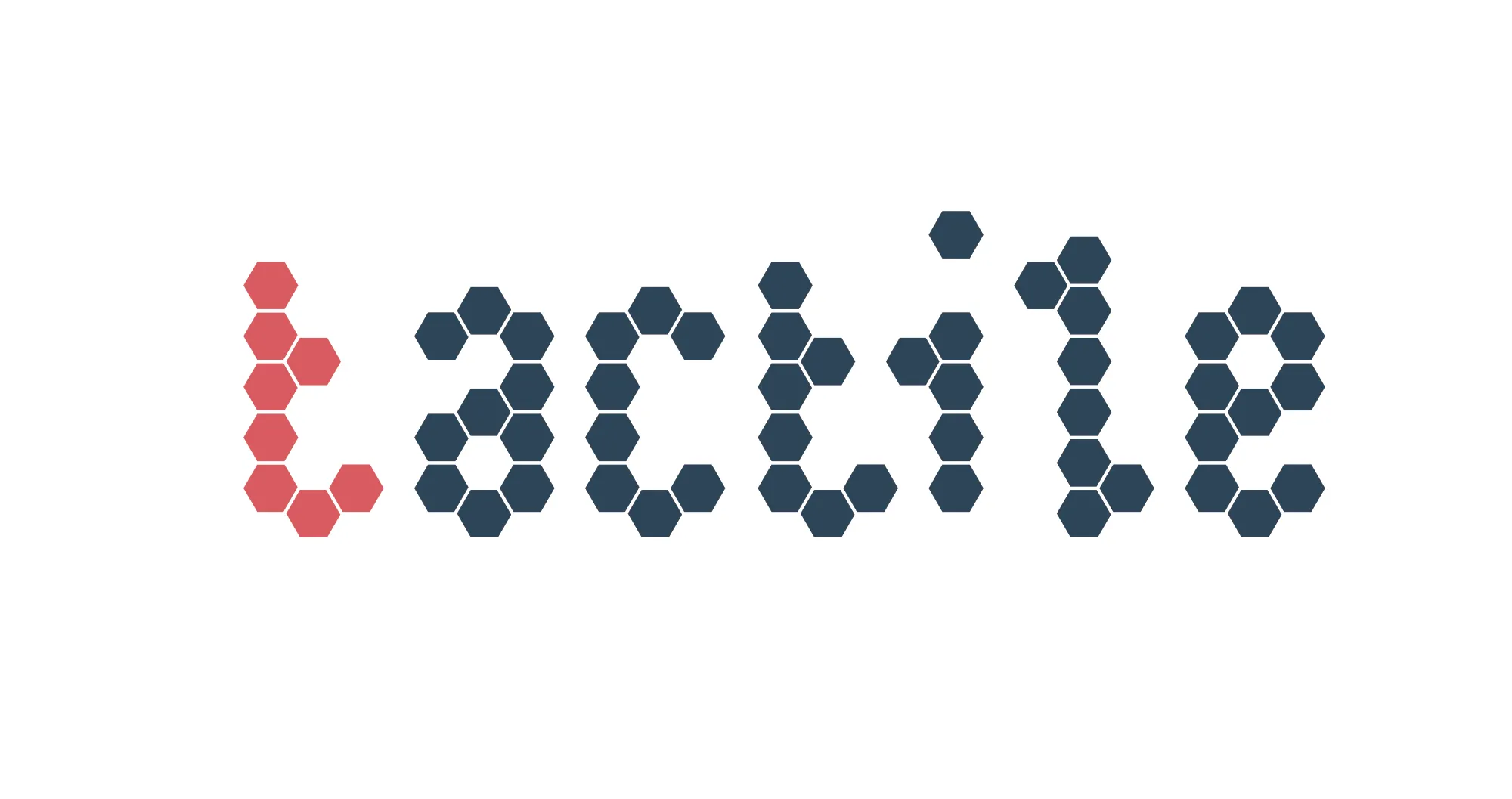
My very first assignment was to come up with a brand: a name and a logo. At that point, the company was very techy in that focused on technological solutions for events that involved simple physical interactions of their visitors. This would later develop into for example using wristbands with electronic chips as payment systems. Their tools allowed event organizers to make ‘physical’ contact with visitors in a digital way. This motivated the name Tactile. But as the company was still very tech-heavy at that point, so was the branding:
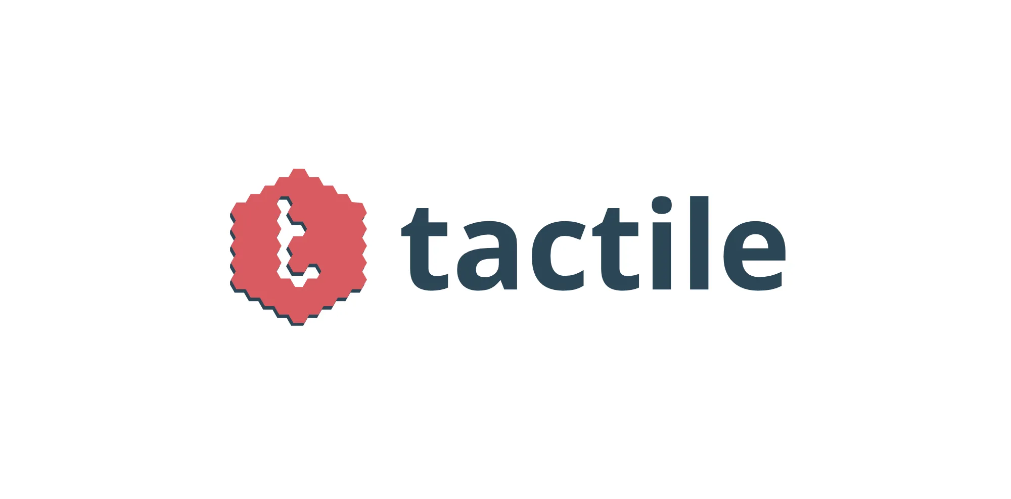
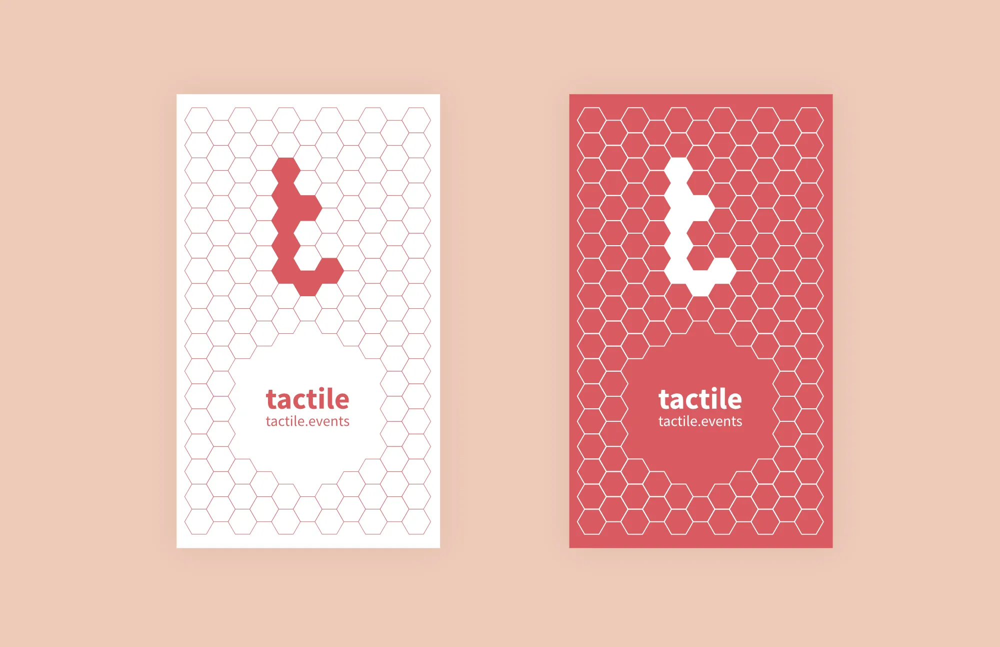
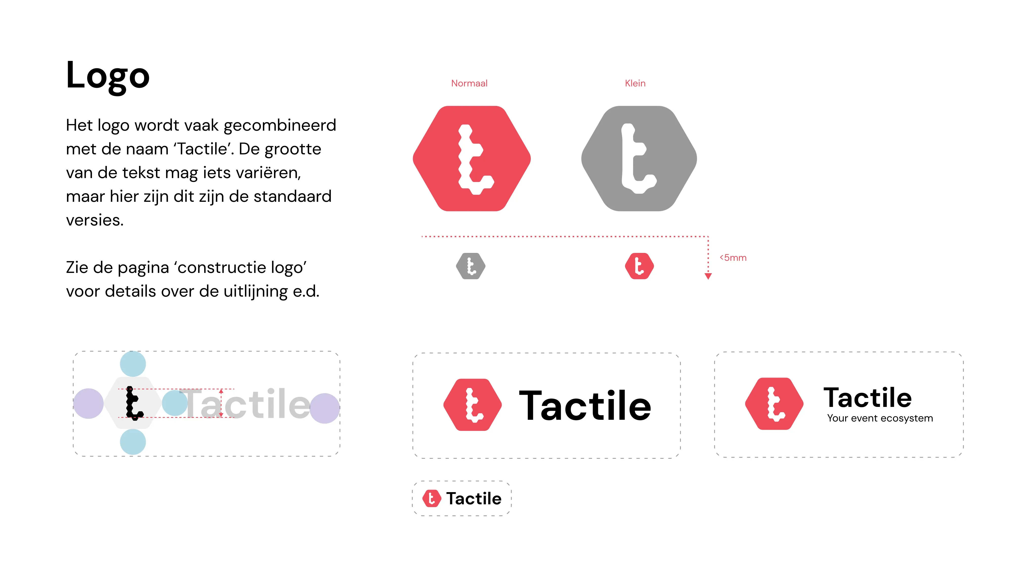
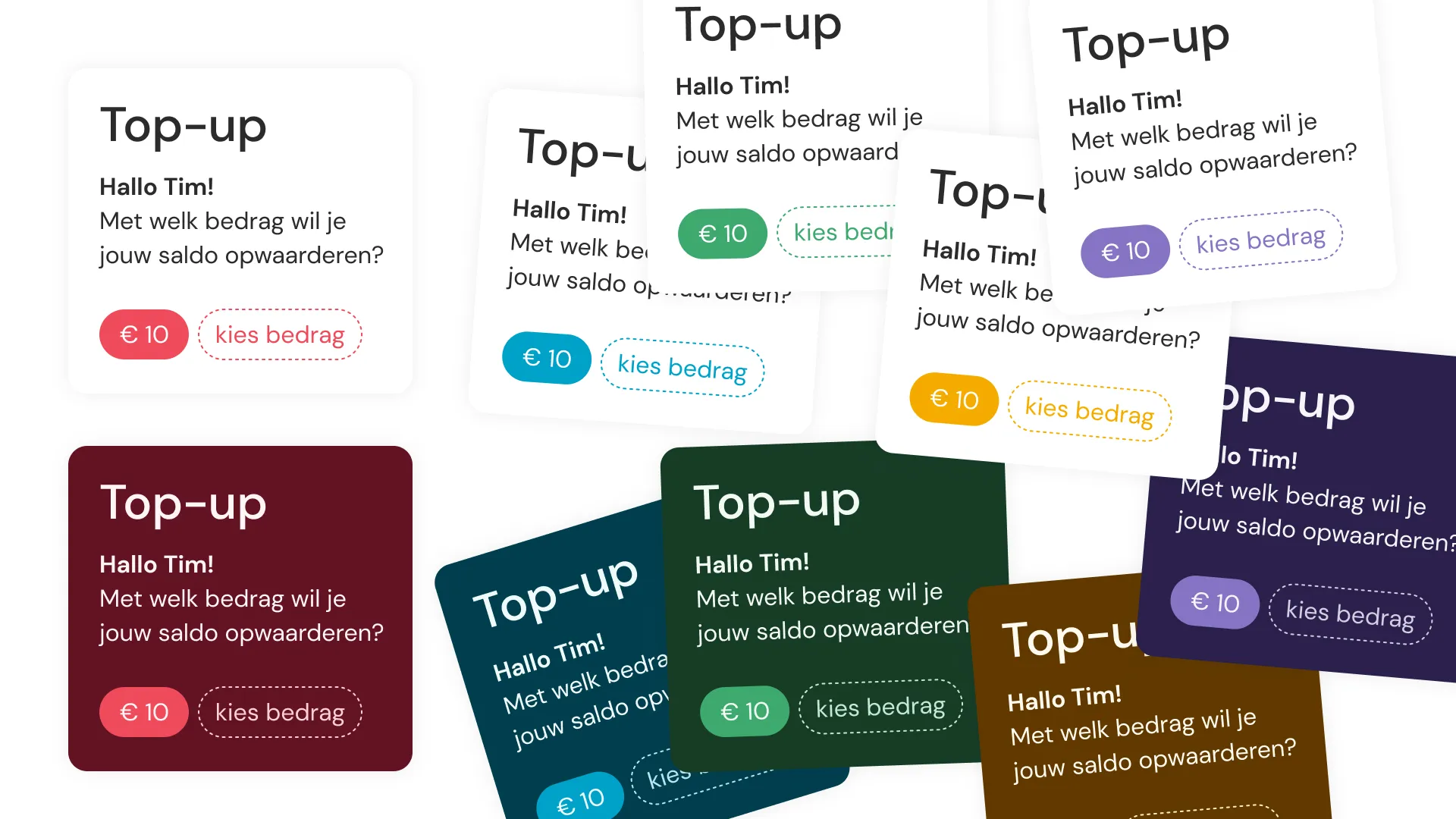
In 2021, I was asked to expand the original logo into a full-fledged visual identity. But with an interesting catch: they worked entirely in Google Drive, and so I ended up designing and implementing the visual identity entirely in Google Drive — apparently, that is possible. The basic idea of the logo was maintained, but other than that the entire style was redesigned.
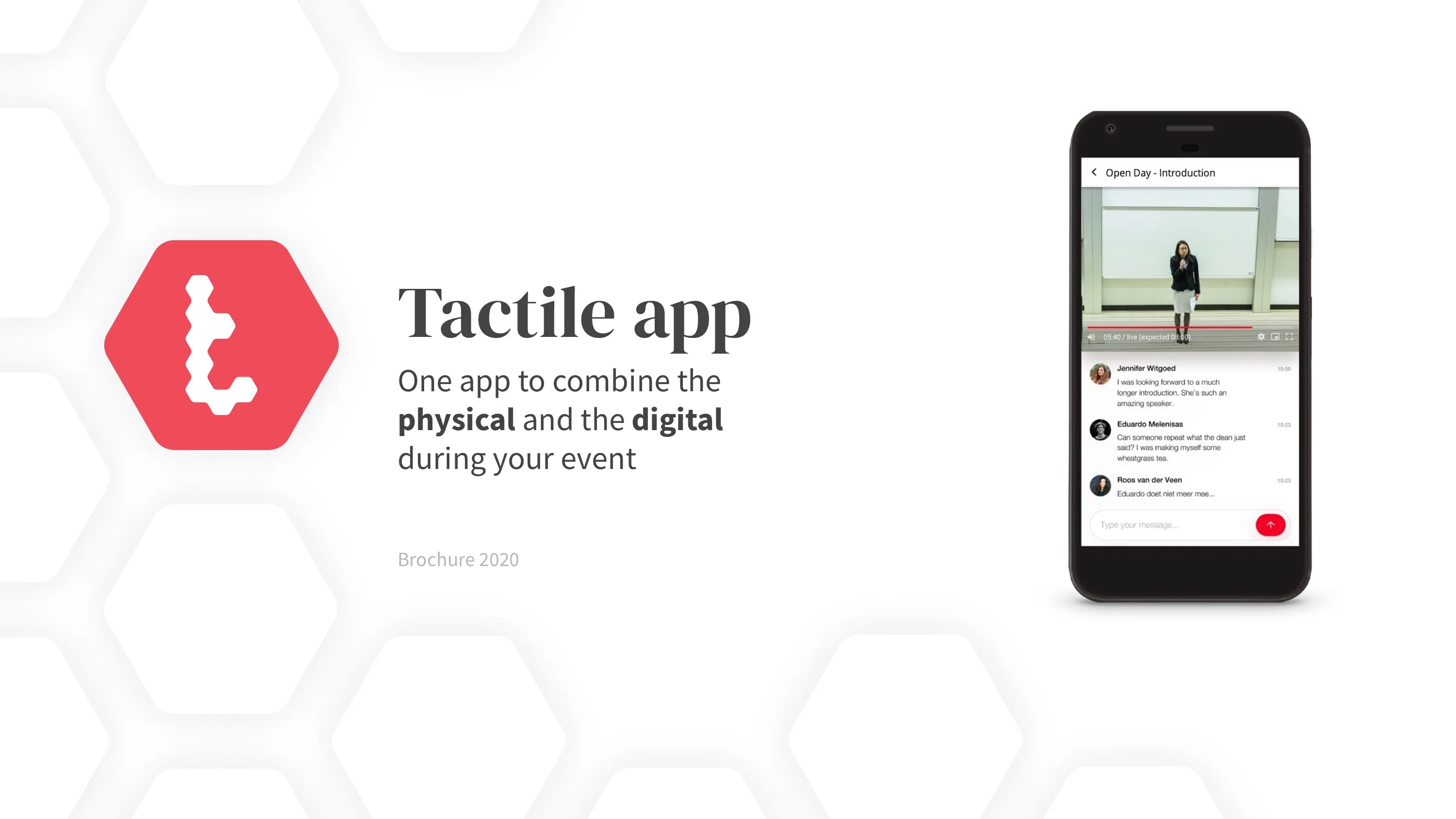
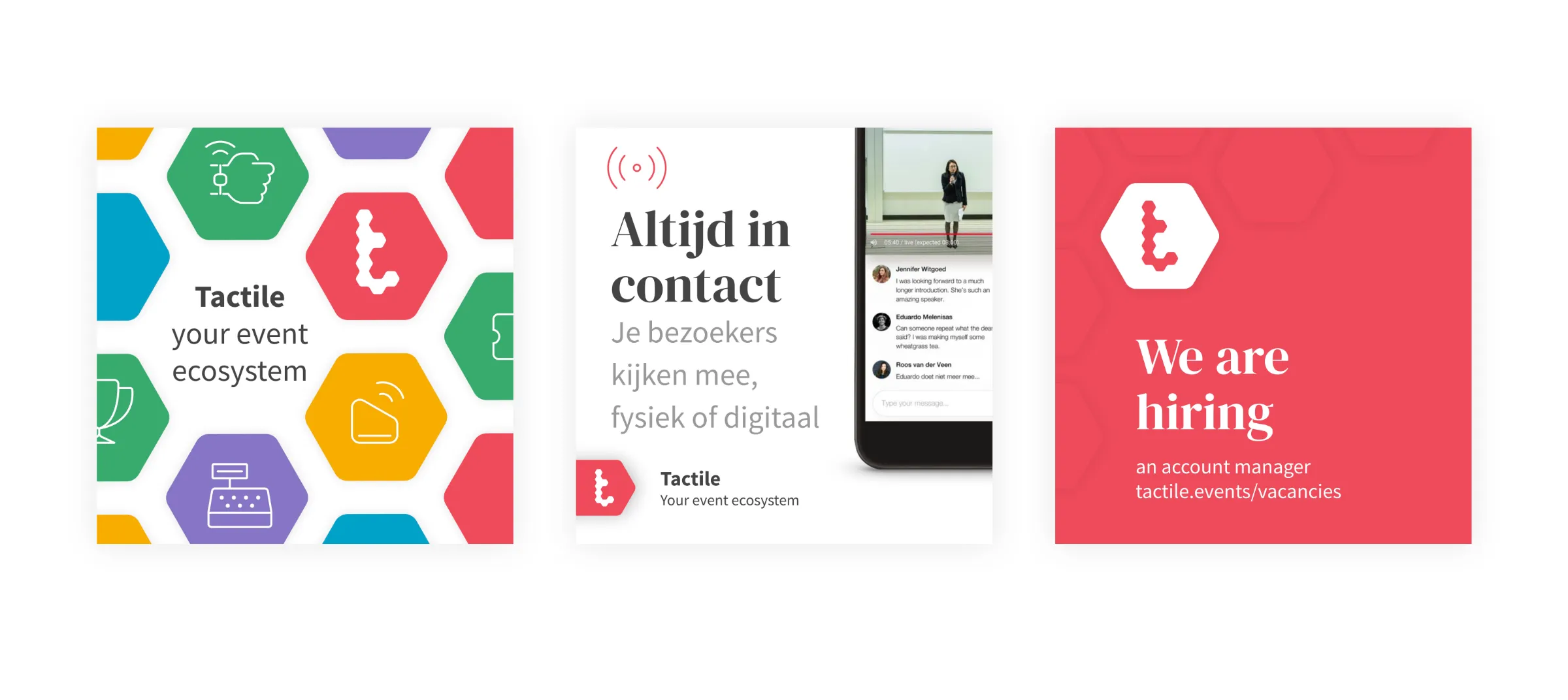
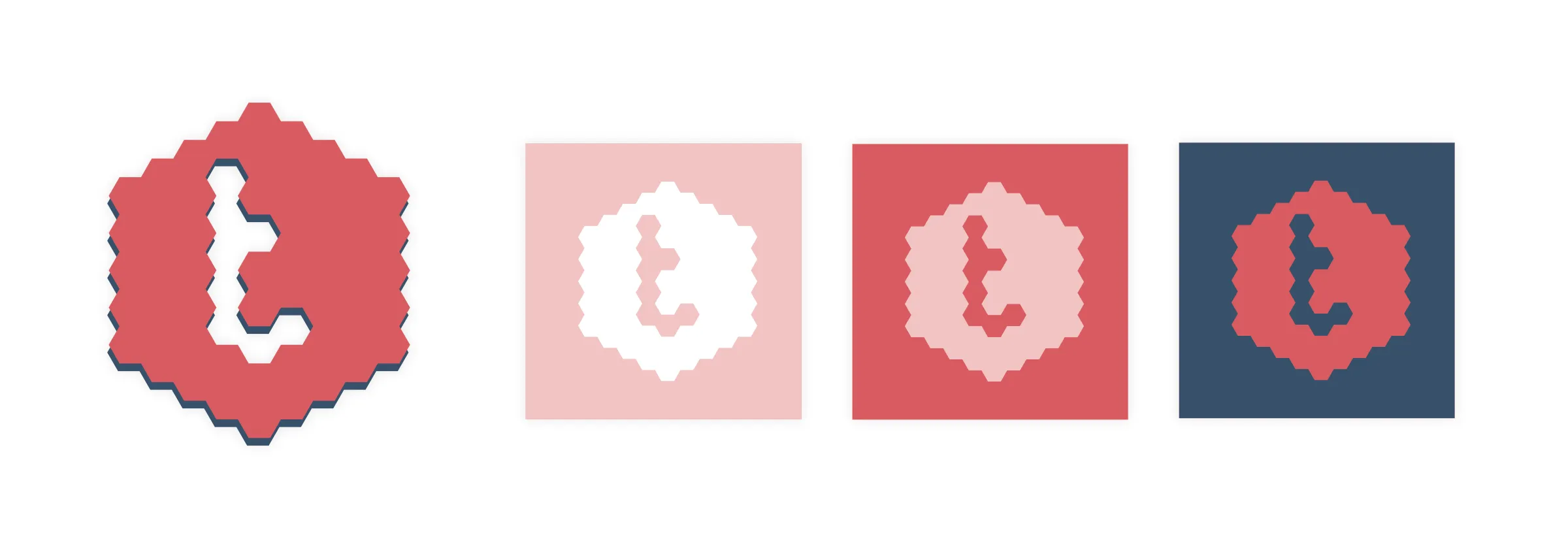
The third iteration of the visual identity (2023) was an upgrade of the existing visual identity. This went hand in hand with a change of workflow, as the company had moved away from Google Drive to Figma. In the updated identity, the logo and color scheme was retained, but the typography was updated with a stronger focus on UI design. The serif display font was also dropped, because it had not been very effective in practice. Finally, the use of the hexagon was changed.